The Pantone Colour of the Year comes about as a result of lots of careful consideration and analysis from those in the industry who know best. So it is always enjoyable to see what the specialists have to say!
Colour experts at the Pantone Colour Institute look through many different industries. These include film, TV and fashion, as well as new art collections, new technological advancements, and even socio-political events and conditions, just to name a few of the areas. It has been going on for 23 years, and the choice of the Pantone Colour of the Year has been consistently influential. Often inspiring trends in many industries and areas of design. It is one of those things that takes the temperature of global trends whilst also sets a marker for the future. For this reason, it is worth considering which colour they choose; it can give you design inspiration which will be on trend, and maybe even a bit ahead of trend. Let’s take a look at the Pantone Colour of the Year 2022 …
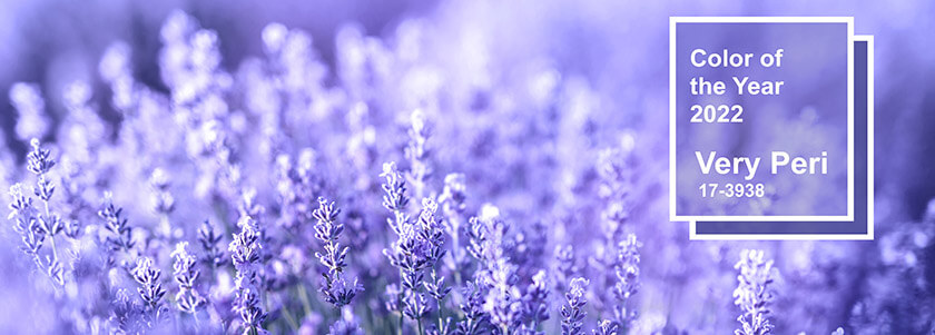
… it’s ‘Very Peri’
A New Pantone Colour Whose Courageous Presence Encourages Personal Inventiveness And Creativity.
pantone.com
Very Peri (PANTONE 17-3938) is a blue / purple hue has been chosen so as to encapsulate the kind of creativity and imaginative expression that marks so much of what is going on in the present day. Merging the traditional feeling of a blue and the vibrancy and energy of a red. This lavender style colour at once points to the future, whilst not turning its back on all the things that we know and love from the past. It is a great choice for the times we live in, and we think that its carefree confidence will be a boon to many an interior or event.
More About Very Peri
Pantone have said that they have taken much inspiration from the digital world when choosing this periwinkle blue style colour. Digital creation methods have opened up new ways in which those in the design industry can express themselves. In this case, they have looked towards avenues such as computer game graphics and the rise of the metaverse. Pantone have traced the way in which trends in these digital worlds have been expressed in the physical world, and how in turn the physical world has influenced the digital world. Although this might all sound a bit confusing, there is something of this idea expressed with clarity in this new colour.
Very Peri is itself something new and a fusion of things already present. The complexity of this new red violet infused blue hue therefore is able to get across how our world has become so much about the subtle fusion of the traditional and the futuristic.
How to Use the Pantone Colour of the Year 2022
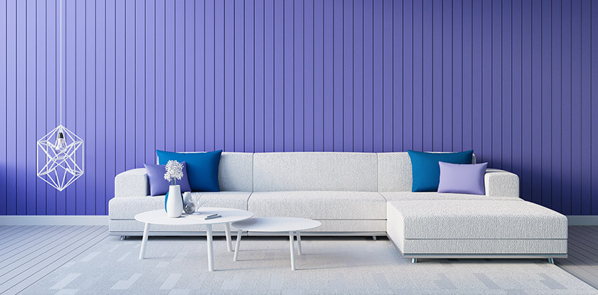
If you are looking to redesign an office space, then you might think about using the Pantone Colour of the Year 2022. A simple paint job on a choice wall might be one way to achieve the desired effect. If you don’t have an appropriate wall to use for this redesign, then choose some smaller accessories to spread the feeling of creative energy in a more subtle way. This might be anything from vases and planters to cushions and accessories.
We think in particular that Very Peri will be a perfect choice for creative spaces. If you work in any creative industries, then choosing some items of furniture or even decorations in this colour for the office space might create the right mood for a productive day. Indeed, there is something about the colour which can be highly calming. It would also be a good choice for galleries, cafés, shops and other commercial spaces which you would like people to walk into with a sense of relaxed interest.
For the home environment, purple / blue hued tealight holders can be a lovely method of infusing a room with the spirit of Very Peri. This works in a similar way if you want a room at home to be a place of cultural enjoyment and creative inspiration. A touch of the creative mood goes a long way. This is the case for the studio and study, but also for those spaces such as the library and kitchen. Anywhere where it helps to have the mind put into a state of curiosity and calm yet alive energy.
Floral Decoration
One way of sprinkling dashes of Very Peri into an interior is by using flowers. In a commercial setting, there are many reasons why it can be better to use high quality artificial flowers. These give you the vibrant colour and elegant shape of real plants, but won’t cause you any unwanted fuss. They won’t have to be watered, can be placed in darker areas, will last much longer, and won’t troubling anyone with hay fever along the way.
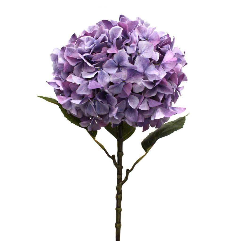
Hydrangea Artificial Stem 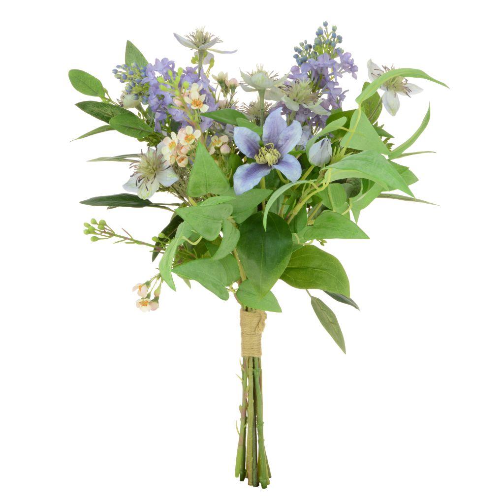
Artificial Lavender Bouquet 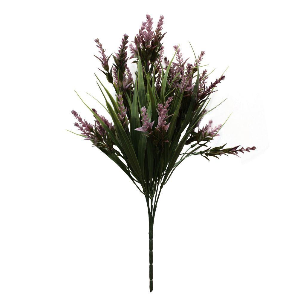
Artificial Lavender Bush 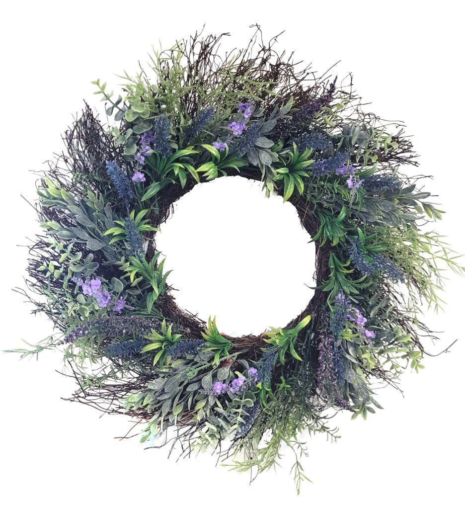
Lavender Artificial Wreath 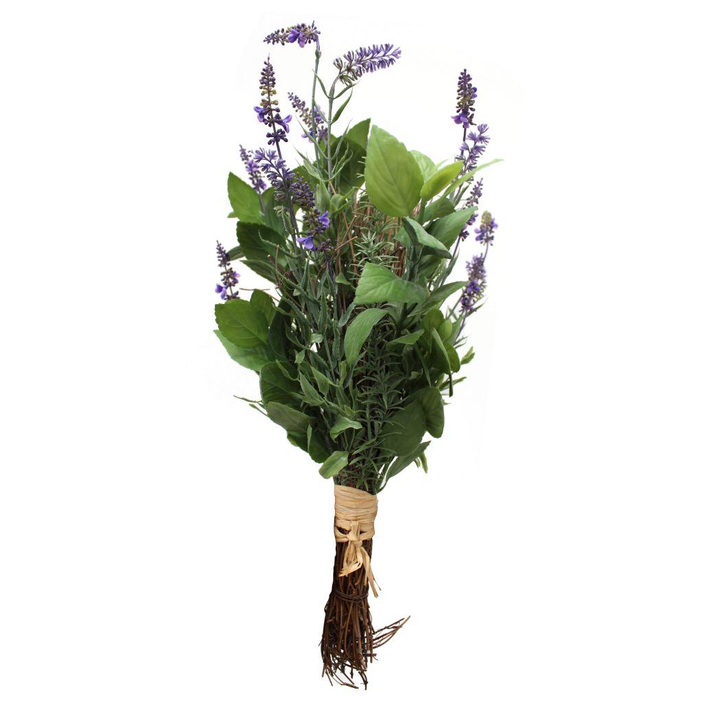
Tied Bundle Artificial Lavender 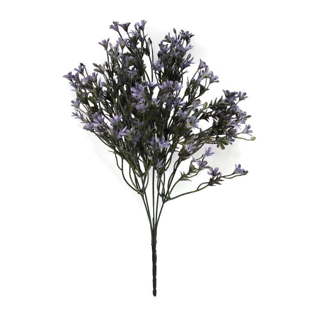
Artificial Mini Flower Bush
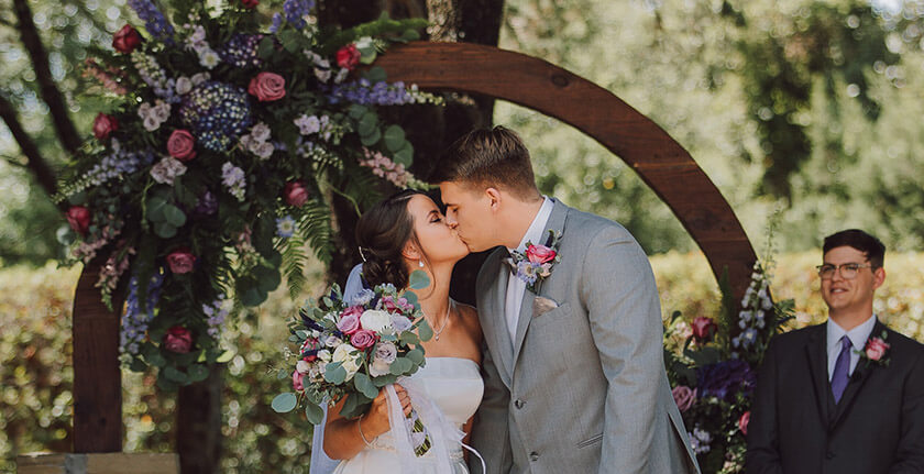
A good choice could be in the form of artificial lavender bunches or bouquets, or even purple clematis garlands or mixed wreaths. These blue hued artificial flowers mixed with undertones of violet red will be a refreshing addition to an event such as a birthday party, wedding or anniversary. They would also set the tone perfectly for a revivifying the home for spring. You can coordinate these floral flourishes with other decorative pieces. Try rustic baskets, sleek planters, ornaments or soft furnishings that carry something of the violet red and blue motif.
Colour Combinations
You should think too about the best colour combinations that work with the Pantone Colour of the Year 2022 . Complimentary colours will brighten each other as they are opposite on the colour wheel. Soft / warm yellows will complement this periwinkle blue style colour nicely. In terms of flowers, try yellow roses and daffodils for example.
Lighter, cooler colours can additionally bring out the best in the violet blue and red vibrancy, so you might also play around with grey tones. Whether that is the grey of a sofa with a lavender cushion, or it might be grey suits in harmony with Very Peri inspired floral arrangements at a wedding.
However, you can also experiment with colours closer to the purple end of the spectrum. For instance, at home, lighter lavender style purple mixed with a darker blue can create a luxurious feel when it comes to pillows, throws and bedding combos. Or try mixing with pinks for a vibrant and fun colour scheme.
Pantone provide a range of other ideas for palette exploration here. From combining Very Peri with neutrals for an elegant and timeless look, to a mix of greens and natural shades for a holistic and harmonious blend. Have fun exploring the potential of Very Peri!