The Pantone Colour of the Year 2023 has been chosen! Every year Pantone pick a colour for the year ahead. Their selection is a way of drawing attention to the relationship between the culture at that time and colour. For over twenty years now, it has been a trend setting event. Those working in interior design wait with great excitement for the next Pantone colour to be announced. It is not just influential in interior design, but also in the world of fashion, social media, marketing, and several other popular cultural spheres.
In terms of the physical world, hundreds of major design brands take on the task of making new products which use the colour of the year. So it makes sense to get in their early and look out for the new products hitting the shelves. We have a particular interest in the colour of the year because of the way that it makes us think about new and exciting ways to reimagine our decor. And this year’s choice is going to be a catalyst for some fantastic new interior design touches.
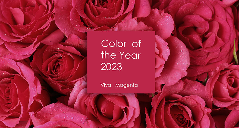
What’s the Pantone Colour of the Year 2023?
And the winner is…Viva Magenta (PANTONE 18-1750)!
If you haven’t come across this specific colour before, then Pantone’s description will be helpful. They state that the colour is a:
… crimson red tone that presents a balance between warm and cool,…
Pantone.com
Pantone always like to choose a colour which they suggest reflects in some way certain qualities of our life in the present day. In this case, the hybrid nature of this colour, as both warm and cool, is said to speak to the increasing hybridity of the way that we live life. The most obvious hybrid quality of life today is the duality of the physical and digital worlds.
A Colour Rooted in Nature
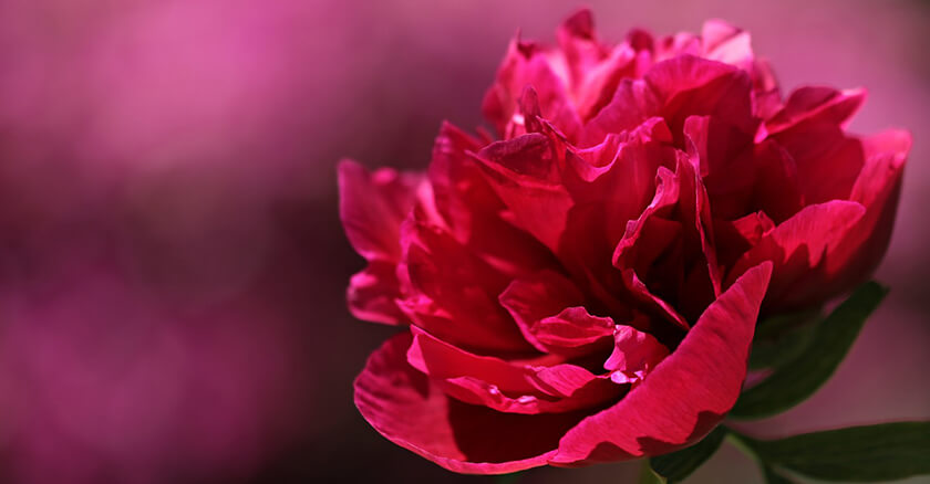
The Executive Director of the Pantone Color Institute, Leatrice Eiseman, reflecting on the decision, indicated that it was important for the colour to have some root in nature and the real, physical world. In their choice of Viva Magenta, they have selected a colour that descends from the red family. The colour has a connection to the red of cochineal. This is one of the most precious dyes from the natural dye family. An extremely vivid tone, this is one of the strongest and brightest of natural dyes that people have discovered.
In this way, Viva Magenta has a deep, primordial appeal. Pantone’s choice aims to reconnect us to a feeling of inner strength, invoking the forces and the beauty of nature. At the same time, its dual qualities as a hybrid tone also speaks to a very modern sense of finding creative joy and inspiration through collaboration and crossing geographical boundaries, all opportunities which our digital age affords us.
Qualities of Pantone Viva Magenta
We think that this choice of colour is inspiring. Viva Magenta is certainly full of vigour, luxury and powerful impact. It has a strength and an energy to it, which creates a feeling of exuberance and passion. Viva Magenta can be used in a variety of ways across the home, as well as in commercial spaces. It has been eight years since any shade of red has graced the Pantone Colour of the Year selections. This bold and strong shade of red perhaps speaks to the way in which 2023 could well be a year of returning to individual and collective confidence.
Following on from over a year of unprecedented change and challenge with the Covid pandemic, 2022 was a time of tentative rebuilding. It took many months for normality to reassert itself. For all of us to start feeling like we were able to go about our lives with a full sense of freedom and enjoyment. Although there are still lots of big challenges to tackle in 2023, there is a sense that we have all had some time to rebuild our lust for life. This colour choice sets things up well to be able to define the year as one of confidence, excitement and sensory enjoyment. Weaving a little bit of this flavour into your interior design or event can be a great way to draw from some of this mood of luxury and optimism.
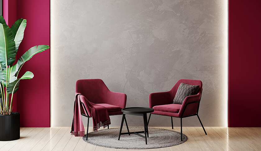
How to Use Viva Magenta?
This rich pink-red shade seems appropriate for the end of 2022 and the beginning of 2023, because it chimes well with the winter season. However, you can also use all through the year to add a depth of character to a space. The primordial magenta hue of this red shade has such force and depth that it pairs really well with lighter, more neutral tones such as warm whites.
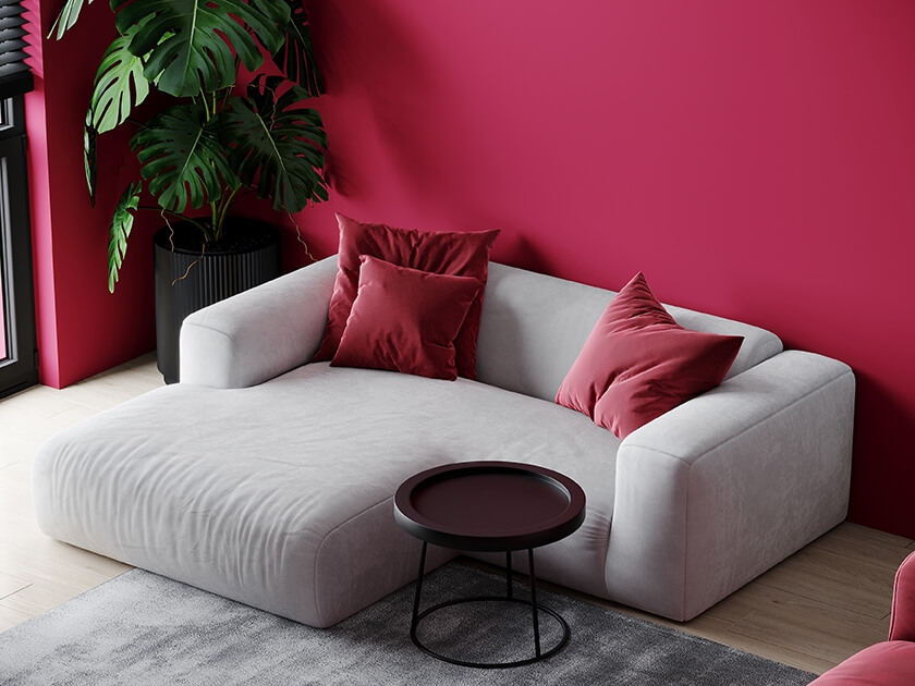
Just a Pop of Colour?
You could easily and effectively add some Viva Magenta candles to stand out against a light-coloured wall or bold coloured cushions on a chair. Try a bouquet of Viva Magenta inspired artificial flowers in a white or pastel painted living room. A similar contrast can be created on at the dinner table with a layering of creams and magentas between the placemats, napkins, tablecloth or runner.
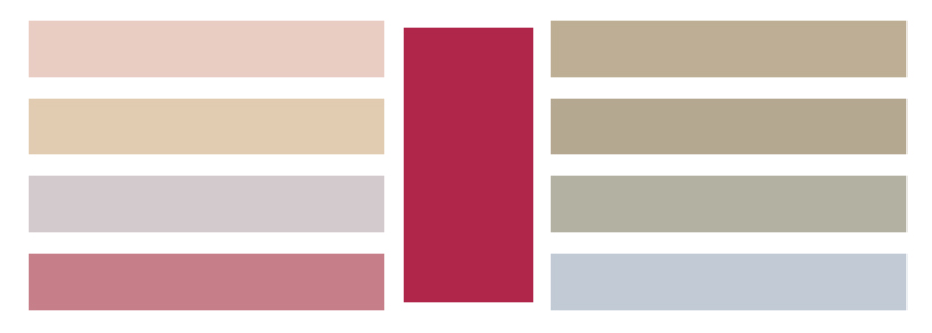
Other colours that work well with Viva Magenta include sandy tones, light grey lilacs, pale khakis, and pale grey-blue tones. You really will only need a small dose to be able to see how this richly luxurious and elegant colour can transform a room. It could even be something as small as a new throw. If you love the colour, then you can work with different, more substantial textures such as lampshades, rugs, home accessories or even furniture.
Whether you are adding a little touch of the colour to your room or going all out and embracing the colour throughout your space, we hope this powerful Pantone Colour of the Year 2023 will bring you positivity and strength for the year ahead.